
How to Use Mobile Mode and Optimize Mobile View
📱 Mobile Mode
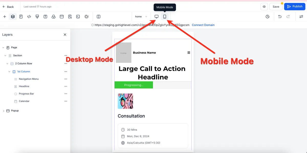
📌 Step 1: Switch to Mobile Mode
1️⃣ Open your page in the Page Builder Editor.
2️⃣ At the top of the editor, click Mobile Mode.
3️⃣ The builder will switch to the mobile view editor.
👁️ Step 2: Understand Default Visibility
All elements are visible on both desktop and mobile by default
💡 You can customize this visibility for better design control.
👀 Changing Object Visibility (Mobile/Desktop Only)
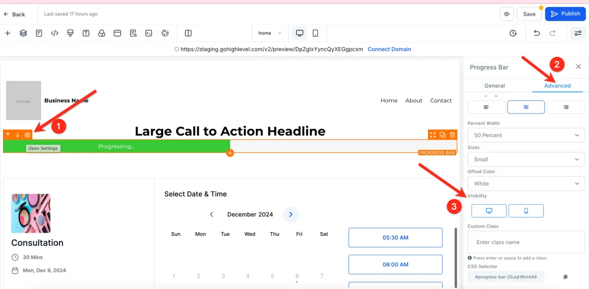
📌 Step 1: Select the Element
1️⃣ Click on any section, row, column, or element.
2️⃣ Open the settings panel.
⚙️ Step 2: Adjust Visibility Settings
Show on Desktop only
Show on Mobile only
📊 Step 3: Understand Visibility Behavior
If Desktop is disabled → element shows only on mobile
If Mobile is disabled → element shows only on desktop
💡 The builder will display elements based on your selected view.
⚙️ Mobile Responsiveness Settings
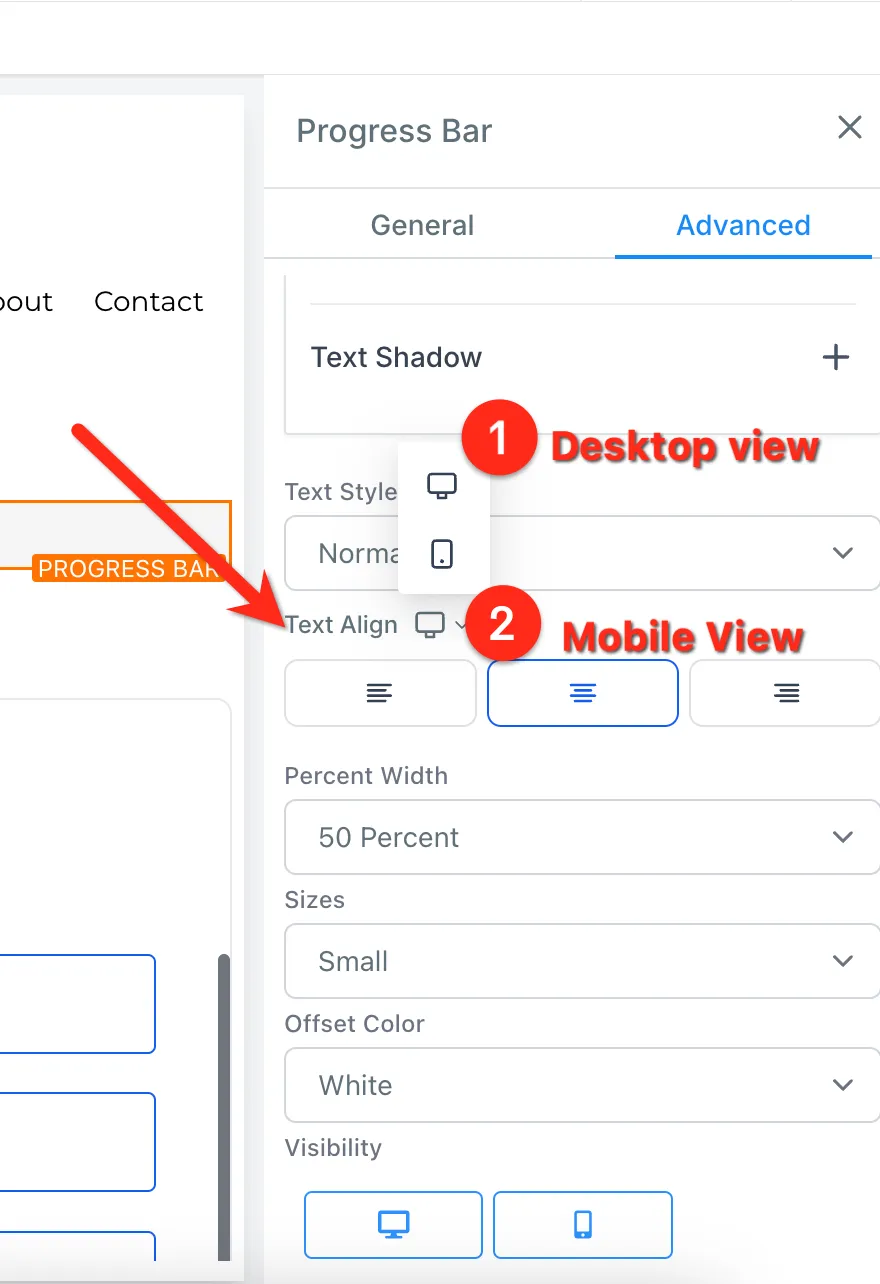
📌 Step 1: Edit Device-Specific Settings
1️⃣ Select an element.
2️⃣ Look for mobile responsiveness toggles in the settings.
3️⃣ Adjust settings separately for:
Desktop
Mobile
Example:
Change alignment on desktop
Set a different alignment for mobile
📊 Expected Result
Elements can have different styles per device
Your layout becomes more flexible and optimized
💡 Pro Tips for Mobile Editing
✅ Best Practices
Finish Desktop First
Complete your desktop design before editing mobile
Use Mobile-Specific Sections
Create sections only for mobile when needed
Duplicate + Customize
Duplicate elements, then:
Set one as desktop only
Set the other as mobile only
Optimize Navigation Menus
Use Global Sections for consistent mobile menus